Introducing a New Logo for Lnuwey Dêbludaqan Wikuom

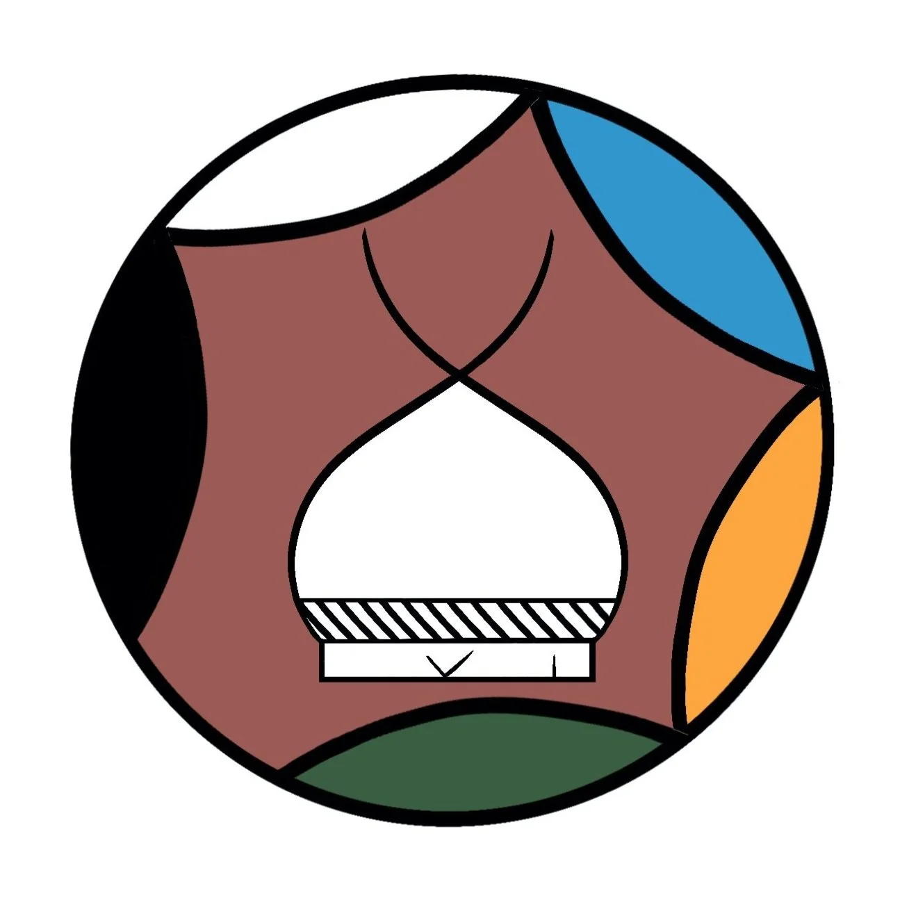
The Lnuwey Tplutaqan Wikuom's logo is based on three central ideas: community, interconnectedness, and openness.
The central image in the logo represents a wikuom (or wigwam) styled after several depictions found in petroglyphs at Kejimkujik. Wikuoms are traditional Mi'kmaq shelters constructed from poles covered with birchbark strips which were sewn together with spruce. Wikuoms have had many purposes throughout history, including as family homes and community gathering spaces. Today, wikuoms are often used for ceremony. The choice to feature a wikuom was inspired by our organization's name, which in turn was inspired by the role in of wikuoms in Mi'kmaq culture as places where families build their homes, ceremonies are held, and communities gather to discuss how we ought to govern ourselves.
The five curves which encircle the wikuom were inspired by the insignia of the Mi'kmaq chiefs, also recorded in petroglyph imagery. The chief's insignia itself contains seven curves, which represent the seven districts of Mi'kma'ki. In the case of the logo, the five curves represent the five nations within the Wabanaki Confederacy. The gap which leaves these five curves open is meant to represent nation-to-nation solidarity, as well as our openness to connection with all people and things.
Finally, we've recently updated our logo to incorporate the six primary Mi'kmaq colours. From left to right, these are black, white, blue, yellow, and green - with the final colour, ochre, in the background.
Editor’s Note: Kristan uses the Smith-Francis orthographic system in this article, a Mi’kmaq writing system which is used in Nova Scotia, PEI, Newfoundland, and now in certain parts of New Brunswick.
Kristan Belanger was raised in Wilmot, Nova Scotia, and is a member of Glooscap First Nation. Kristan has a Bachelor’s Degree in political science from Dalhousie University and a JD from Dalhousie University’s Schulich School of Law.


